Simply put, a responsive website automatically adjusts the site content to suit the screen/device it is being viewed on, all from a single content source. It is essential that a website gives the user the best possible experience, that content uses a fluid and flexible layout that adapts to their individual device, allowing them to navigate easily and find relevant content fast.
Remember trying to view a desktop version of a website on a smart-phone? The act of pinch zooming in and out, scrolling horizontally is frustrating at best and isn’t by any means user-friendly; after a quick sigh, most users will go elsewhere!
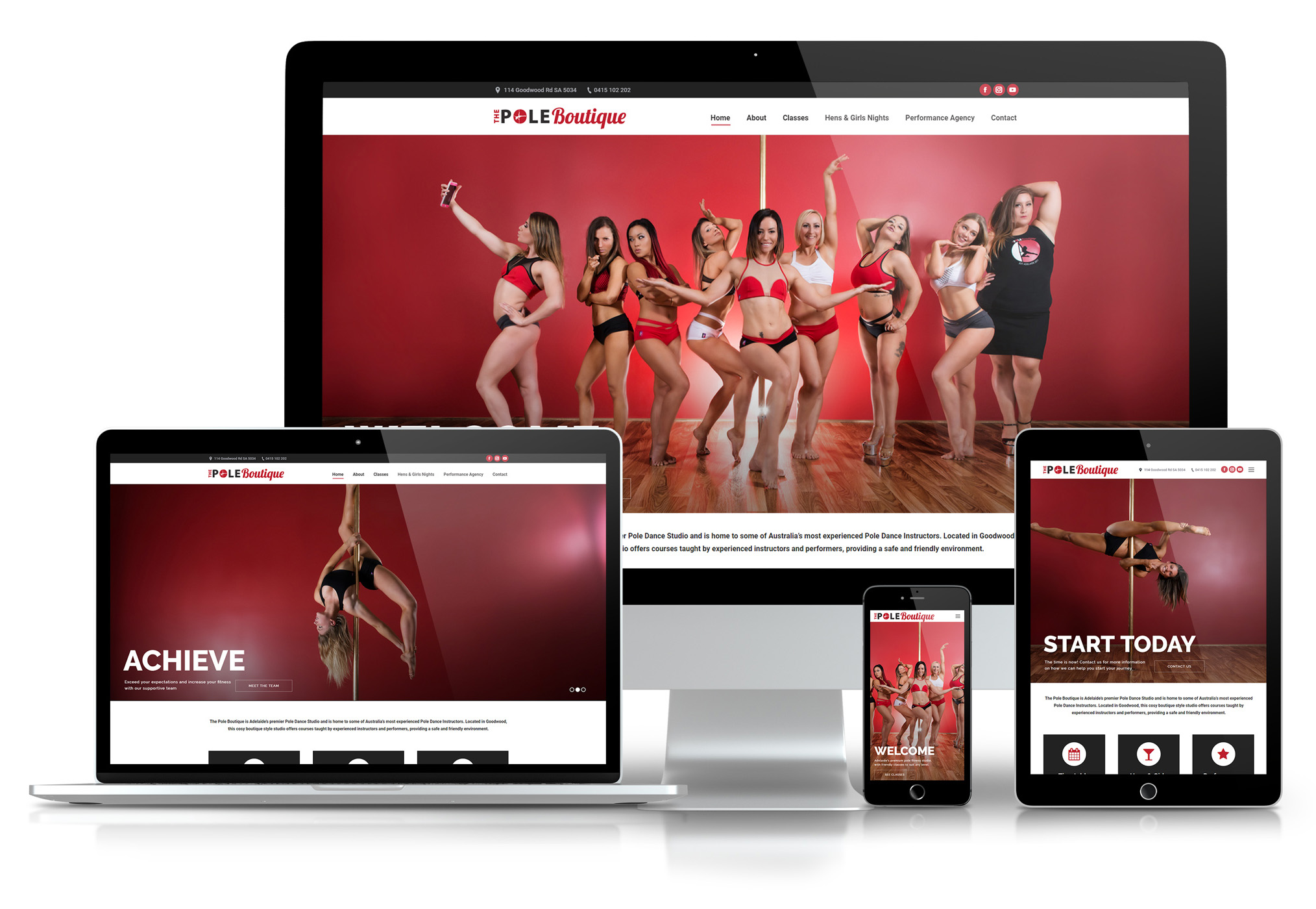
From a User Interface standpoint its easy to see the advantage of better display practices that responsive design offers, but it is also preparing for the current trend of mobile phone use into the future; think about the last few years and how your mobile phone behaviour has increased. New phone models with better display and faster processing power make viewing the web quicker than ever and the attachment we have to these mobile devices is only increasing, with statistics and trends showing this.
Its currently estimated that over 60% of online searches are now performed on a mobile device, with mobile searching growing at 10x the rate of desktop.
(See full link)
So, despite creating a better experience for website users, why is having a responsive website important?
Well, google indexing for one. Any website owner knows the value of playing nice with the almighty Google; to have correct SEO measures in place, content constantly being added, and gaining any advantage to climb to the top of search results. Google algorithims are always being updated and having a responsive website is another important contributor to be aware of, and may help out-rank your competitors.
Google scans each page of your website and checks certain criteria to test for ‘mobile-friendliness’ – these factors include looking at page load times, text is readable without zooming and that content fits a screen without the need to scroll horizontally.
From a design and a business standpoint, having a responsive website is of up most importance now, and especially moving into the future, to give your business the the greatest chance of success.
Where to go from here?
Check your site to see how Google views its ‘mobile-friendliness’, and don’t hesitate to contact us for more advice and how we may be able to help!